+48 503 050 909
 biuro@widiart.pl


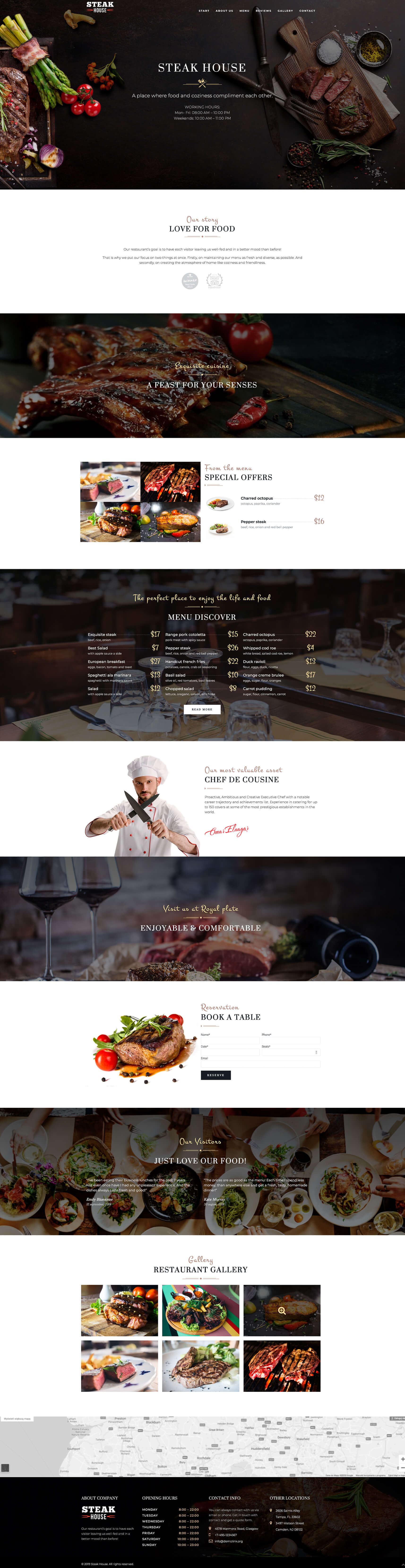
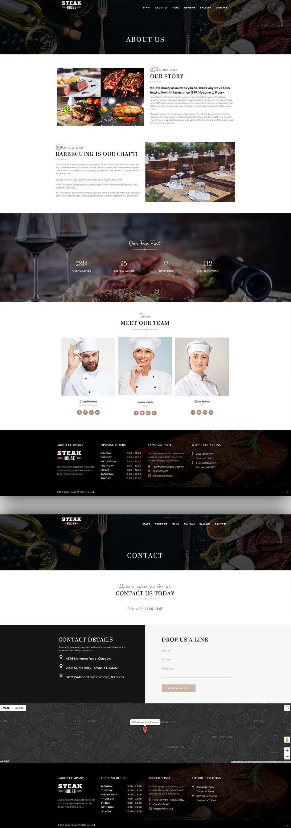
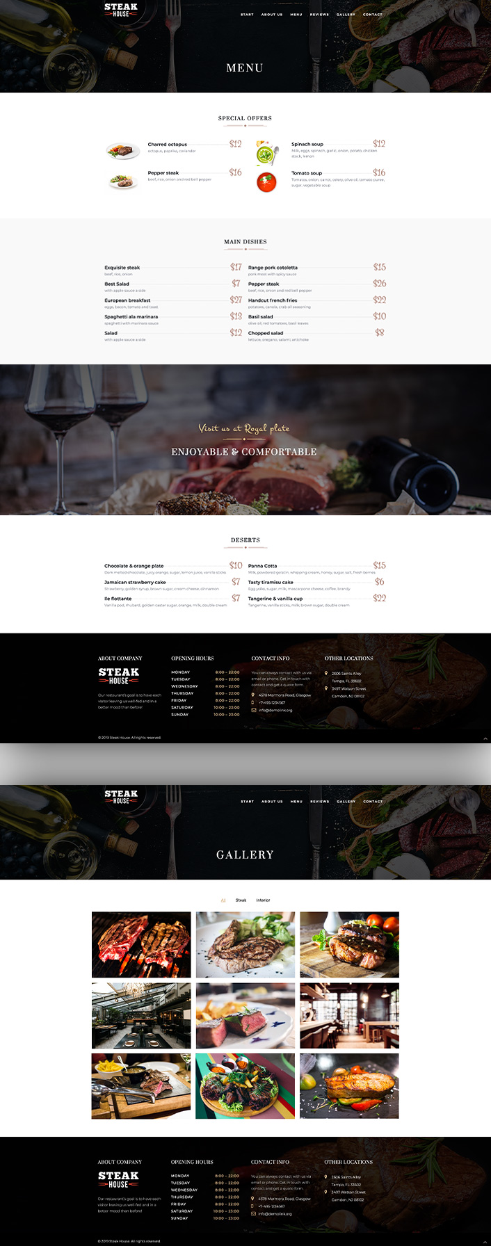
Our restaurant’s goal is to have each visitor leaving us well-fed and in a better mood than before!
That is why we put our focus on two things at once. Firstly, on
maintaining our menu as fresh and diverse, as possible. And secondly, on creating the atmosphere of home-like coziness and friendliness.

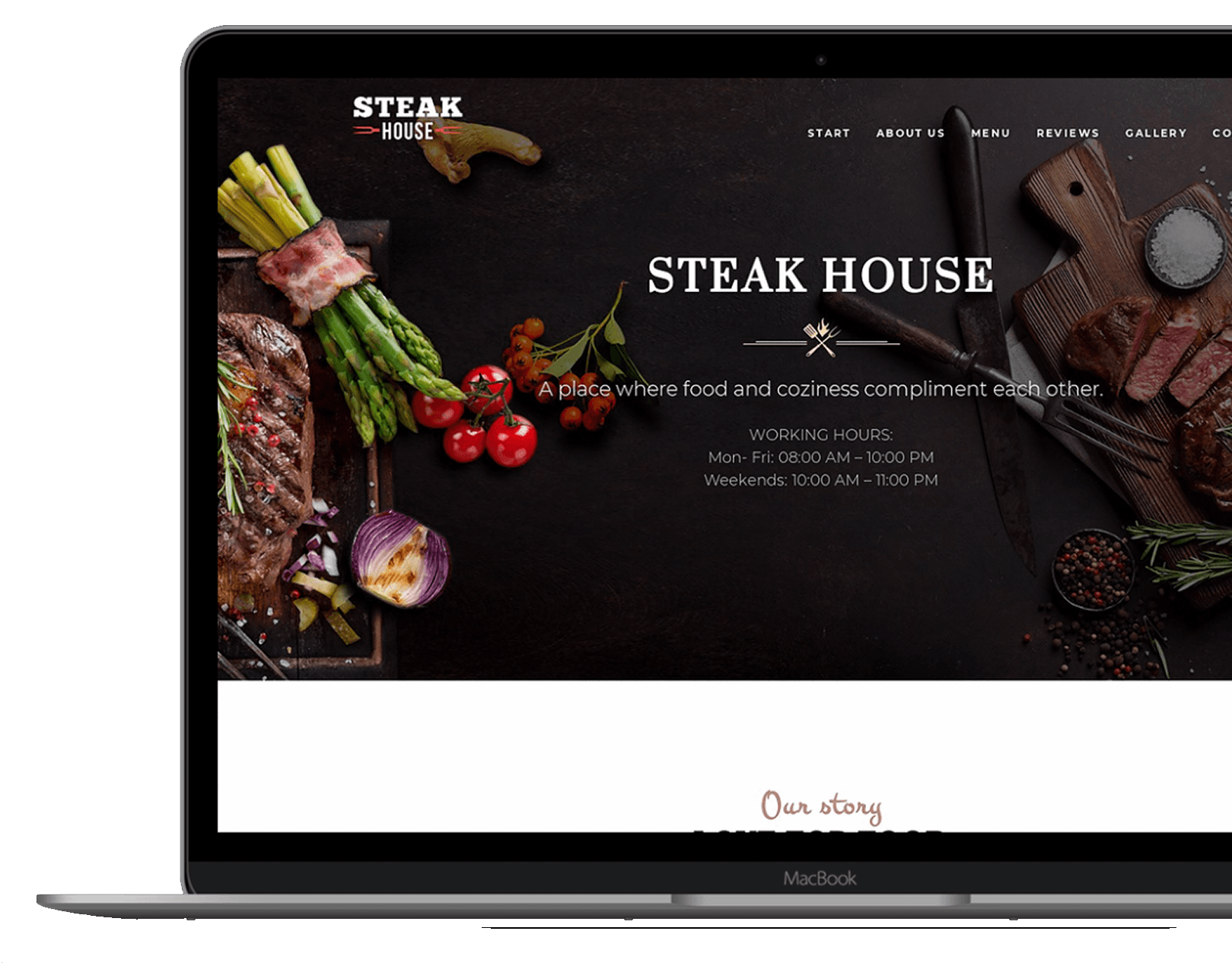
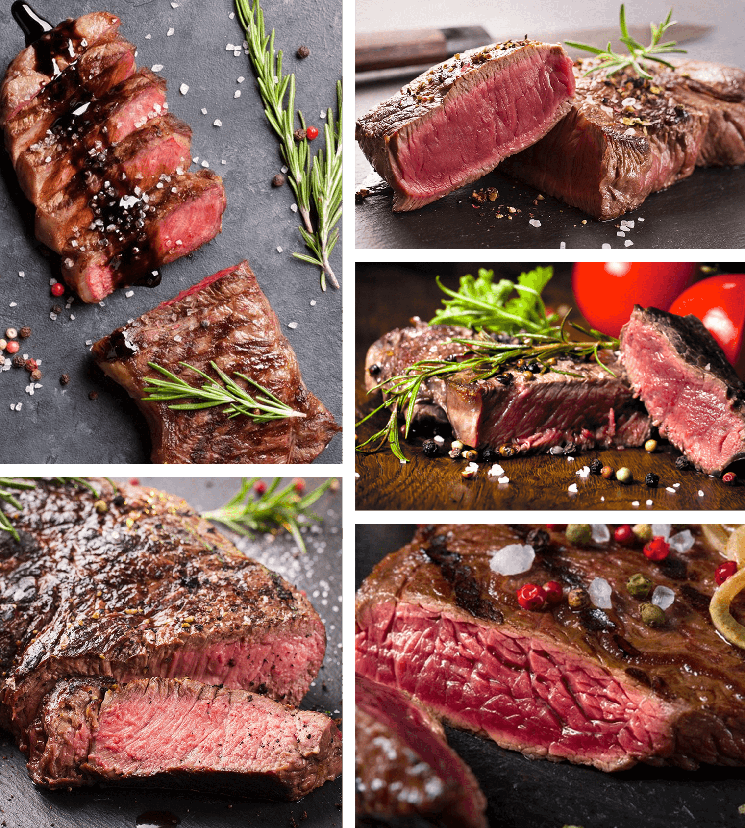
Before start working with design we visited main and production
officed, and take more than 100 photos with products, people and process.
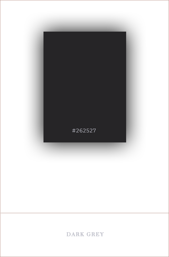
We chose the main dark color for the background to contrast with photos, light of gray for the test and the elements, and gold for emphasis and active elements

We use two basic fonts & minimum styles. “Suranna” as the main font for headers, sub-headers and main text. “Montserrat” is a secondary font for the subtitles, quotes and links

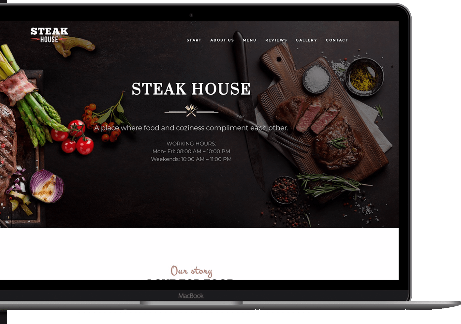
The design of the pages, we have focused on the beautiful pictures and the possibility to order the produkt online. We also focused on useful information to the user, for example, such as delivery and payment.